ADD SHOT: Whitney Claflin at Bodega
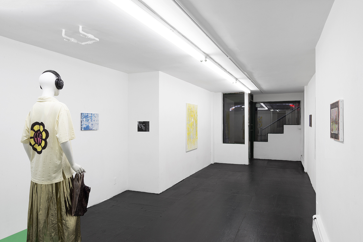
There’s a sparseness to Whitney Claflin’s exhibitions, creating an impression that things are thinned out, in short supply. In ADD SHOT, an imperative exhibition title to which one might reply “OK, fuck it,” a white room hung with paintings is presided over by an old-fashioned mannequin on a display stand, wearing clothes and headphones that the artist might wear. The last days of Barney’s come to mind: the sight of luxury items stripped of their usual display devices and appearing just as they are. Yet this atmosphere of lack is not simply one of absence. ADD SHOT is characteristic of Claflin’s recent exhibitions, in which a stylistic variety of paintings are addended by sculptures, audio components, and other elements, creating a tenuous yet insistent web of relations, subtly conveying that things are only just managing to hold it together.
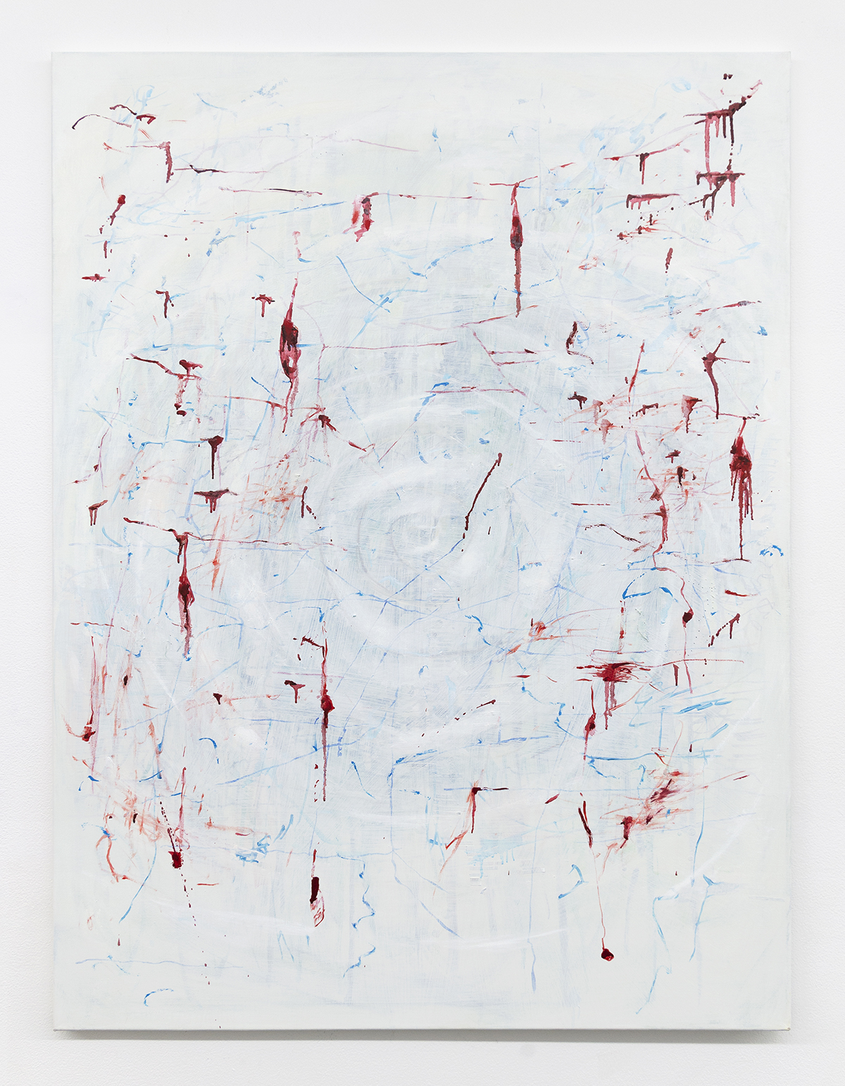
In Claflin’s painting VAMP U.S.A (all works 2020), bluish-white ground forms the base for a large central white spiral, covered with a delicate lace of scratchy strokes in red and blue. The red lines, in particular, resemble fresh razor cuts, appearing to bleed with droplets and clots that spill down the canvas. The red-white-and-blue palette evokes the Star-Spangled Banner and other American symbols, yet if this painting has a formal relationship to the flag, it is one that has been distorted into a bleached out death spiral. Made in a year when America’s global reputation for death ascended to the top of several charts, it’s perhaps an appropriate enough emblem for the state and its failures. However, there is also a performative goth attitude to those gory drips, like the conspicuous blood drooling down from the corner of a red mouth on Halloween: the VAMP of the title might refer to vamping as much as it does to vampires. On the one hand, 2020’s most prominent horrors are institutional, not readily depictable within the aesthetics of horror or painting or flags; on the other hand, many of the figures in power who are responsible are literal ghouls, almost kitsch in their cravenness. Is sincerity vs. performativity even a valid distinction in such a context? Such looped thought processes create a double bind in Claflin’s painting, a snare effect that is echoed in several works in ADD SHOT.
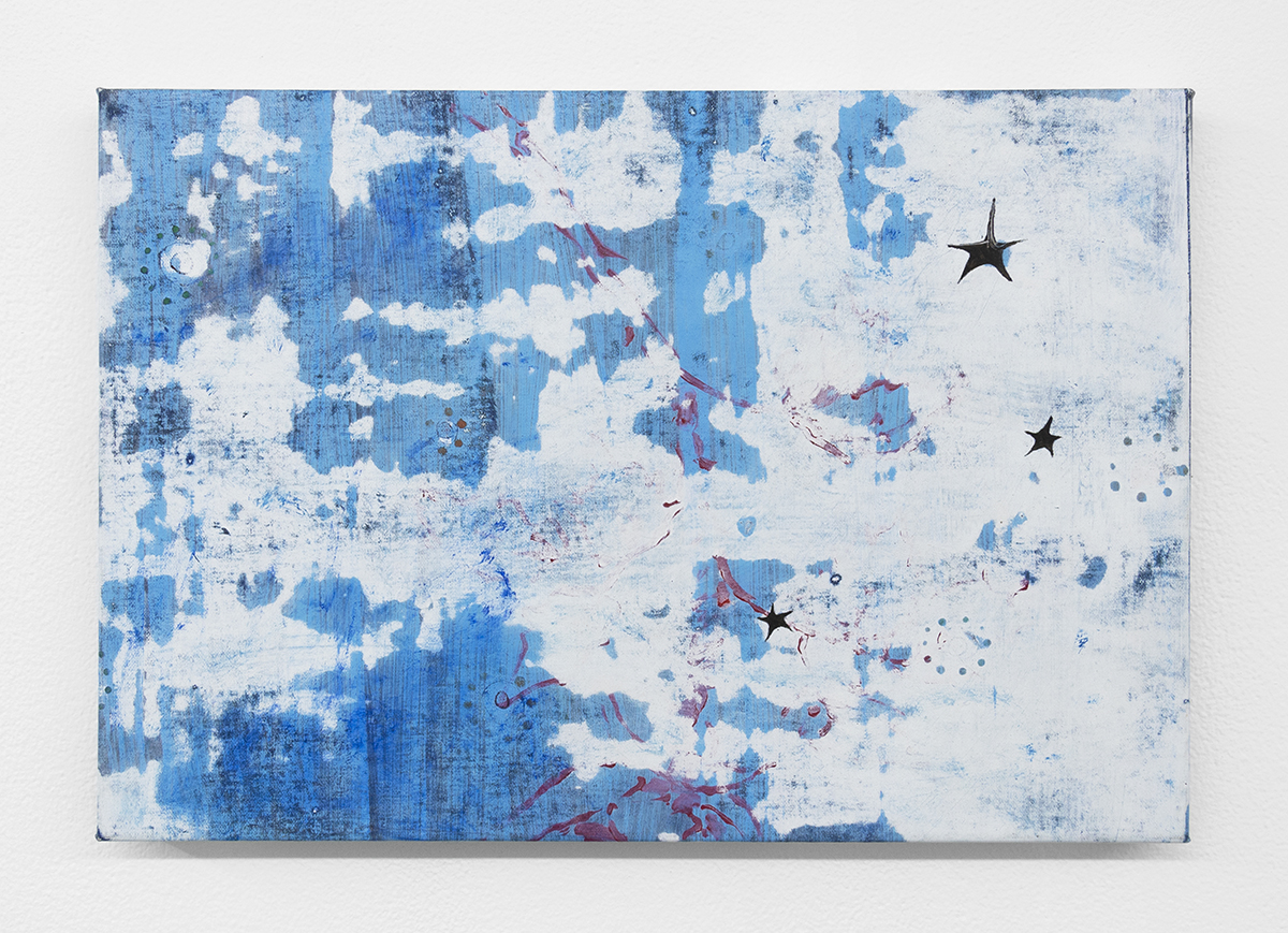
While a second canvas, three stars/ one rose (night sky/ a wall), shares the American-style palette of VAMP U.S.A., it diverges from the former in scale, form, and technique, creating the impression of a distant cousin rather than a sibling. Reworking an older painting, Claflin power-sanded sections away from the surface, creating the layered suggestions of age that one might find by peeling back layers of décor or stone-washing jeans, and new details; three little black stars on the right-hand side of the canvas, redolent of ballpoint pen doodles on a school textbook, are vulnerable and expressive and continue the theme of overlay and appliqué. While the patina of this work is more romantic than its relative, summoning flowers and starlit skies, this symbolism is just as fraught, bringing to mind the layers of emptied out American cliché that one would find in Lana Del Rey lyrics.

On my visit to the gallery, Claflin told me that Charlotte Perkins Gilman’s gothic short story The Yellow Wallpaper (1892), a feminist literary touchstone, had been in her thoughts during the year. Confined to a room with the eponymous décor by a doctor husband who insists that a “rest cure” will benefit her health, the protagonist of Gilman’s story begins to see figures lurking in the walls, behind the pattern of the paper. As her diaristic account unfolds, the reader is left with a haunting, ambiguous story of either ghostly possession or manic psychosis: the woman in question merges with the figure trapped behind the hostile pattern, claiming that she crawls out at night. Imprisoned in a room with bars on the windows, however, the protagonist is damned any which way the story is read.
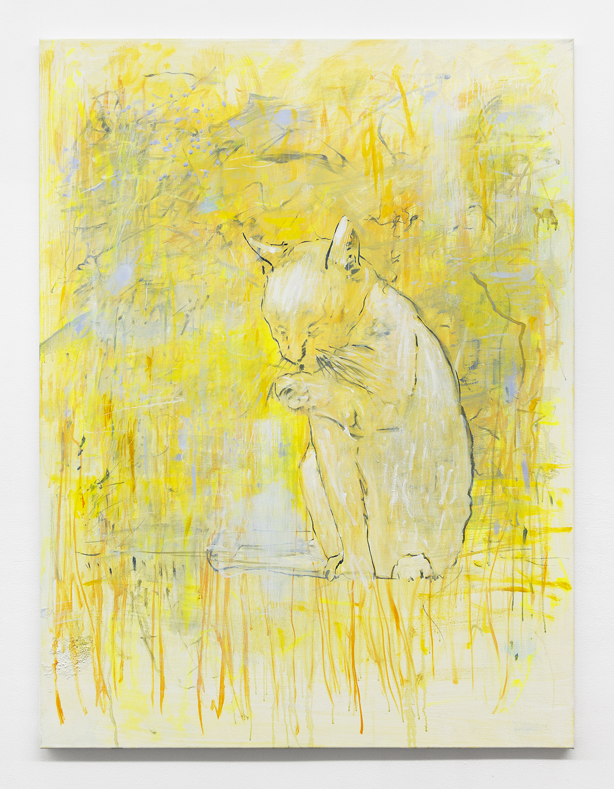
As well as carrying messages about forced domestic “cures” as a form of patriarchal control, the story also might resonate in a year in which many individuals were consigned to their homes and found themselves in psychological tumult, staring at the walls. The most apparent connection to Gilman’s story is perhaps made in LOVE (!!!), a work of stretched found yellow fabric with a bold graphic pattern of woozy flowers, with a flower-power style patch in the shape of a daisy attached with the word “LOVE” emblazoned at its center (the same design is painted on the back of the mannequin’s pale-yellow polo shirt). A second found-fabric work, All signal, no noise (!!!), was made from an olive-colored skirt with a sinuous, almost grammatical pattern in black glitter. Like a helpful guide to the pattern’s laws, Claflin has picked out each distinct element of the design with a different brightly colored dot in fabric paint. Both works are concerned with pattern as structure, carrying both apparent and hidden messages, yet when a figure does emerge from a kind of yellow wall it’s in the shape of I prefer walking (Veeza), a large expressionistic painting dominated by Joan Mitchell-esque streaks of buttercup yellow. The soothing shape of a cat licking its paw emerges from the scene. As a form of wish fulfillment, I prefer walking is a gentle image of domestic peace, finding a more ominous partner in Spaces, a small pink canvas of a thrillingly bright landscape in shades of peacock and iridescent pink, a feverish vision of a fantasy outdoor space, suggesting the mind of a person who is held inside. The natural world seems to burn with red flames, and the picture is heavily enclosed by a thick black border, summoning the painted frames of the British painter Howard Hodgkin.
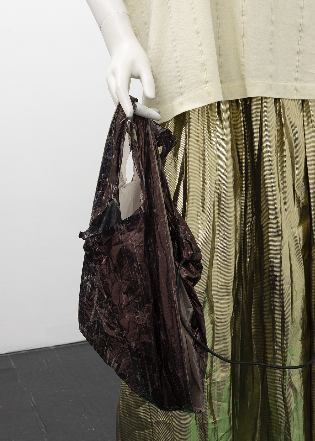
Among all these works, outside these domestic imaginaries, Claflin’s mannequin appears to move along the flimsy tightrope between them, listening to songs of the city on the exhibition’s Soundcloud mixtape, and carrying a cheap plastic bag covered in dark pigment. This painting seems to have been created to move through the streets. “I feel much less alone,” said Claflin in March this year, in an interview with Domenick Ammirati in Artforum, “knowing almost everyone has landed on the same thin ice I’ve been skating on for years.”1 The bag-as-painting keeps moving through the city, moving through the gallery, singing its own story of tenuousness. It’s survival in the city when you live from to day to day. City streets don’t have much pity. When you’re down that’s where you’ll stay, in the city (ah-ah).2
Laura McLean-Ferris is Chief Curator at Swiss Institute, New York, and a writer who regularly contributes to Artforum, ArtReview, Art-Agenda, Even, frieze, Mousse, and Flash Art International. She was the recipient of the 2015 Creative Capital | Andy Warhol Foundation Arts Writers Grant, and her short-form collection The Lacustrine was published in 2016.
NOTES
1. “Helter Shelter,” Domenick Ammirati in conversation with Whitney Claflin on Artforum.com, March 27, 2020. https://www.artforum.com/slant/domenick-ammirati-talks-to-artist-whitney-claflin-about-surviving-an-economic-shock-82590.
2. The Eagles, “In The City” (1979), included in the audio component of Whitney Claflin’s Mime in a Merry Go Round (2020), accessed at https://soundcloud.com/bodegaa/add-shot.