Slipperiness Is Important: Whitney Claflin in Conversation with Wendy Vogel
A moment of serendipity opens artist Whitney Claflin’s conversation with critic Wendy Vogel. Claflin is wearing a WENDY necklace, a playful nod to one of the names she was mistakenly called in her youth. Other similarities connect the two. They are self-described “elder millennials,” both born in 1983, and share cultural touchstones common to their micro-generation. References to the band Pavement, the dive bar Great Jones Cafe, early 2010s women’s online media, Zombie Formalism, and the tween clothing store dELiA*s can be found in Claflin’s artwork, if you know where to look.
To mark the occasion of Claflin’s show I was wearing this when you met me, on view at MoMA PS1 through August 25, Vogel joined the artist for a walkthrough. Her facility with Claflin’s references enabled her to dive deeper into the process that bore her works. “I understood immediately that her process reaches beyond the two-dimensional,” Vogel writes. “Her works unfold through material exploration, as well as over time and space, embedding the conditions of making directly in them.” Claflin’s “cool lady vibes” reverberate throughout the show. To Vogel, Claflin’s practice is gritty, playful, and authentic, “united by a sensibility that combines improvisation and introspection.”
In the following abridgment of their wide-ranging conversation, Claflin and Vogel discuss the artist’s serendipitous use of found materials, deflating macho space, language, and “how to recreate a vibe.”
— Lumi Tan, 2025 EIR
Wendy Vogel: Where should I start? Do you want to start with the WENDY necklace that you’re wearing?
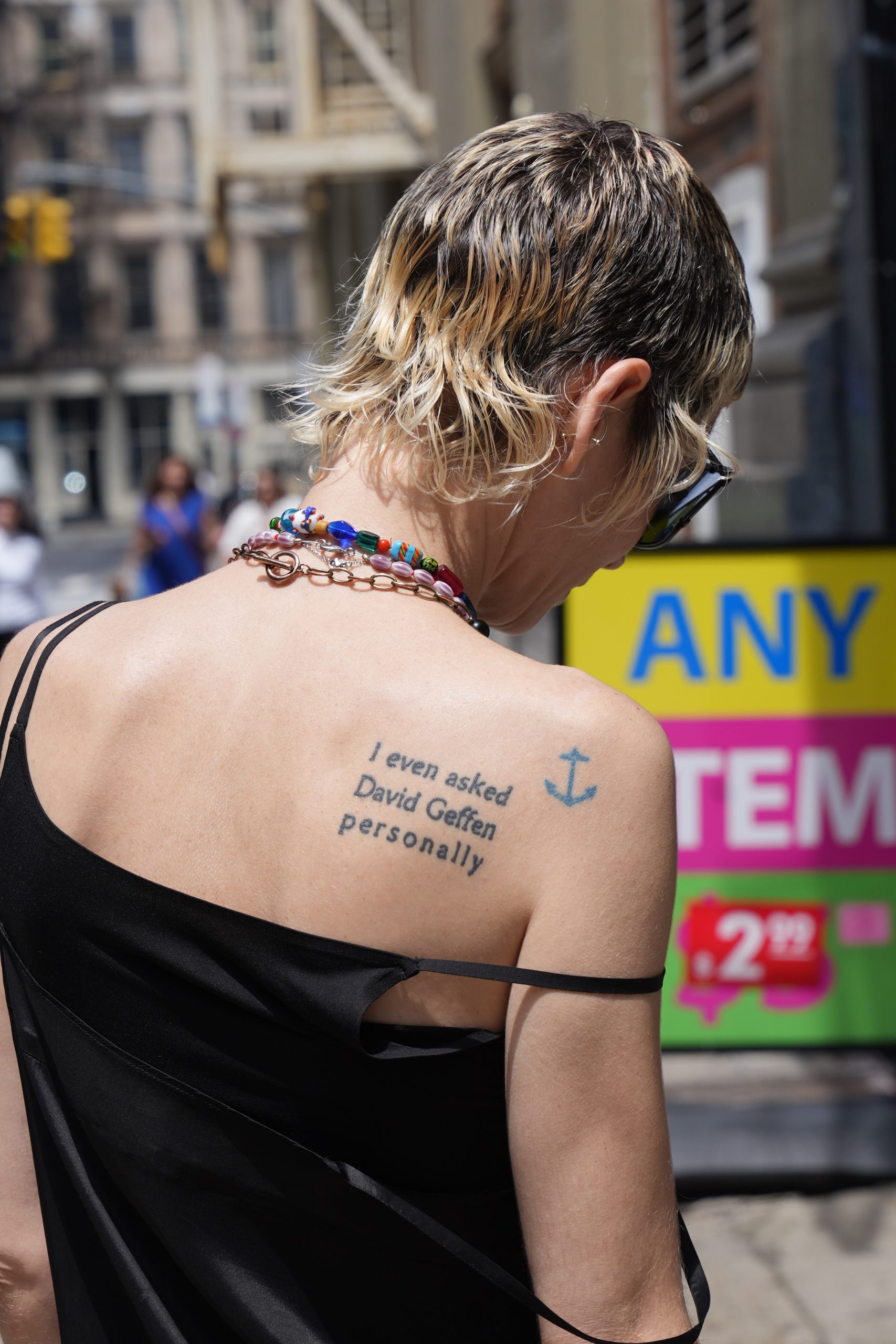
Whitney Claflin: Let’s start with the work that it became, high performance ultralight sunglasses (2025). This is a cyanotype made with a solar printing kit that you can buy at the craft store. When I was in high school, I thrifted a necklace that said “Wendy,” like this one, at the Saver’s in East Providence. Because people would call me Wendy or Courtney if they messed up my name, I knew I had to get it. When I started college at RISD a few months later, I was always wearing it. During orientation, people would call me Wendy, and I would say, “No, it’s Whitney.” It was my type of humor at the time.
When I first found out about this show at MoMA PS1, I immediately knew I wanted to create a cyanotype in the James Turrell permanent installation, Meeting (1980–86/2016). But I also knew it wouldn’t really work because of the way he manipulated the direct sunlight in there. Turrell’s installation includes a huge opening in the ceiling through which viewers can watch the sky throughout the day. It would require a super long exposure for a cyanotype—the whole thing would sort of bleed out. I thought that could be cool: it would be a simple, dramatic abstraction that would be the record of an event. I was turning the institution into a slacker camera, using its light and space to record time visually, breaking the process of photography down to its most basic elements in a playful, lo-fi way. I was not granted permission to do this, so I did the cyanotype in the courtyard instead. I was like, “well, that’s still the institution.” It’s important to be able to be flexible and improvise.
At this point, I knew what most of the works in the exhibition would be, so I was trying to create new pieces that would converse well with the range of older works. I was most interested in the idea of using the light and space of PS1 to make an object, but I wasn’t wholly sure what I wanted that object to look like. I decided it should either be abstract or linguistic. I thought a sun print of the Wendy nameplate necklace could be cool because it is both a true and false autobiography. I found a seller on Etsy that creates custom nameplate necklaces, and had a replica of the original made, since it broke around 2003. I brought a bunch of cyanotype paper out to the PS1 courtyard and tried out different motifs. The one I wound up choosing for the exhibition is an orb-like image, which came from moving a coaster I made across the paper during the exposure time. The coaster I used is included with my book of poems, Food & Spirits (2022), so it’s still autobiographical, just more abstractly.
If anyone messes my name up, they call me Emily.
It’s like a name ladder.
But then I feel like Emily is—
It’s a whole different name.
I’m glad that we started here, because I was thinking about a couple of our similarities. One is that we are the exact same age, and I get your reference points. But I also feel like there is something specific to our micro-generation, with in-jokes and subculture.
And pedagogy. A lot of the painting is about the ways painting is taught in an academic setting, which I also associate with our generation—always undoing the schooling.
Many of your works refer to ephemera from subcultural spaces, like an Academy Records price sticker (Ten Nineteen, 2019) and a Great Jones Cafe matchbook (Untitled, 2022). These signifiers were important for people of our generation to find community. How much do you expect the audience to get these references at first glance? And is that important?
Basically, not at all. I’m glad that we’re talking about this, because I always skew the delivery or presentation of the work to try to be as accessible as possible, in spite of it being jammed with specificities. While Academy and Great Jones Cafe are subcultural institutions, they’re also a vital part of the gig economy for artists and musicians. I think of these pieces like glyphs. They allow me to use image and language simultaneously to call in tons of references very quickly, but their treatment is very delicate and gentle, especially compared to some of my denser works. They’re quieter and cleaner, primarily out of reverence for what they’re depicting, but also to provide some breathing room visually alongside other things I make.
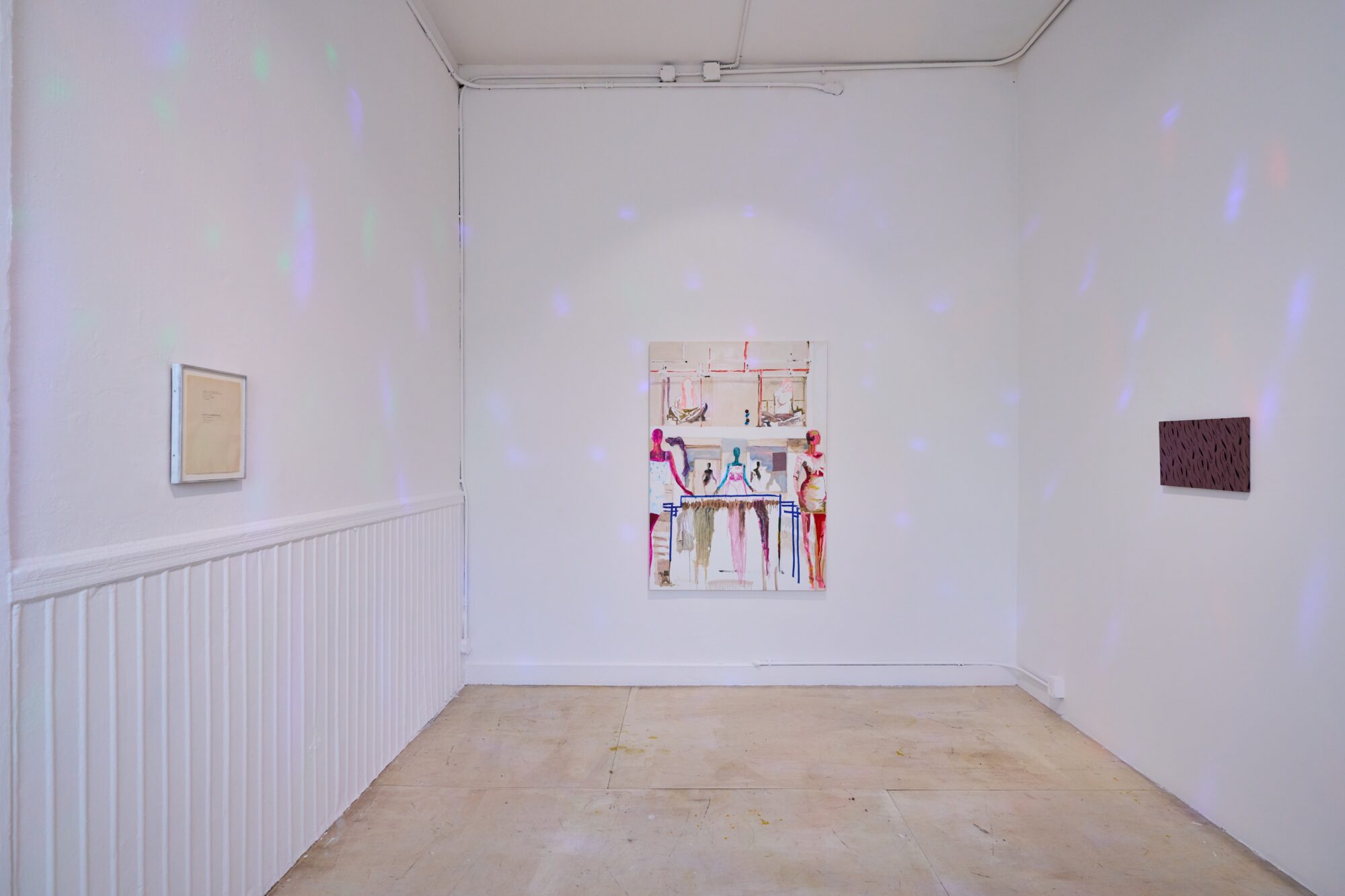
Installation view of Whitney Claflin: I was wearing this when you met me, MoMA PS1, New York, 2025. Courtesy of MoMA PS1. Photograph by Steven Paneccasio.
I know your workspaces are vital to your process. Can you point to a detail in this show that relates to one of them?
The smallest room in the exhibition, the room with the spinning rainbow light, became a recreation of an old live/work space of mine. The walls, ceiling, and floor were all painted white. To improve the ambience, I turned colored lights on during the daytime. I had the exact same spinning rainbow bulb in that space as I do in this room at PS1. I had a typewriter on the floor, so I could sit under the blips of light and work on my writing. The typewritten drawing in this room was made in the conditions we’re now viewing it in. The skirt from All signal was something I was wearing at that time—it hadn’t become a painting yet—so it made sense to hang it in this room for that reason. So now the setting is my old studio, in addition to all the other settings within the individual works, like New York City, Necessary Clothing, and my old wardrobe.
I’m interested in lots of different types of settings being established simultaneously—it almost requires that I work across many formats, whether sculpture, or lighting interventions, or drawing. The photo-based works in the exhibition still make me wonder, “Was this actually a document of the performance of me making it outside? Is it a photo, or is it a work on paper?” Things being slippery is important.
Do you work in fashion?
No, no, no. I just have a passion for it.
“I’m interested in lots of different types of settings being established simultaneously—it almost requires that I work across many formats, whether sculpture, or lighting interventions, or drawing.”
We’re next to one of several fashion references in the show, the piece you mentioned earlier, All signal, no noise (!!!), 2020. This was made from a skirt—sheer, with glitter?
I put this skirt through the wash, and then it didn’t really fit right anymore, so I decided it was time for it to stop being worn. It’s a two-tone iridescent fabric, which is made by weaving two different colored metallic threads together, so it looks green sometimes, and purple other times, depending on the angle. I use interference oil paints a lot, which are made from multiple iridescent pigments, and produce the same color-shifting effect. Repurposing this skirt was a way for me to carry a formal line through different works. The visual effect is the same, even though the materials are different.
I like to let the materials dictate the boundaries of the work, so I decided to work within the existing flocked pattern on the skirt, embellishing it further with vintage fabric paint I found at the thrift store. The fabric paint felt like the right addition, because it’s a color palette that isn’t being produced today, and it’s a complete set. It felt like a ready-made material. Both the skirt and the paint are from the early ’90s. I started to dab the fabric paint into the existing pattern, but would interrupt any logical repetitions, so it’s not a pattern, but just little colored dots that seem like a pattern. While there’s a lot happening visually, it doesn’t add up logically, and the information is always changing.
Are the black-and-white fabric pieces in the first room (host, 2018, and Yogurt the Color of Night, 2012) also made from your clothing?
They are actually from fabrics that I found on the street in Clinton Hill and Greenpoint—I get lucky.
host looks like a Bridget Riley Op art piece. So that’s a kind of winky painter’s joke.
You’re the first person who’s said that before me, so thank you for getting that.
I’m also interested in the ways that the busy fabric forces you to get up close to start to encounter the poetry made from magazine clippings. The phrases appear almost like a ransom note.
Yogurt was my first magazine clipping piece with fabric. I would pull text from magazines when I was like, “Oh, I want to do something, but I can’t paint right now.” I save all the clippings in different bags and jars, so they get totally removed from their original source article.
After that one, I made a policy that I only use The New Yorker, Vanity Fair, and Rolling Stone. They have the best words, and they’re easy to come by.
Your work often incorporates everyday objects and fashion. In its interest with the situational, or making-do, it has been associated with terms like provisional painting and new casualism. Provisional painting is about painting in the expanded field, which seems playful and anti-heroic. But the way the genre is written about, it’s just so dudely. That legacy includes all of the Cologne folks, from Martin Kippenberger through Michael Krebber. On the other hand, if you think of someone like Laura Owens, she’s remixing craft and folk art in ways that are masterful. There’s no denying—
It’s hi-fi.
Exactly. I guess that’s not a question, but an arrangement of terms for you to think through.
I definitely think of the provisional, but I’m trying to get in there and deflate it a bit, by having fun and reinstating it with optimistic vibes. I don’t like explicitly thinking about feminism. I think that’s a bit of my elder millennial bracket, where I have a fear of labels. I think these things are porous and contain a lot of gray. I always hesitate to identify or label.
But I do think about deflating macho space with what I think is fun and joyful. That in itself can be enough for me. I don’t need to be too heavy-handed.
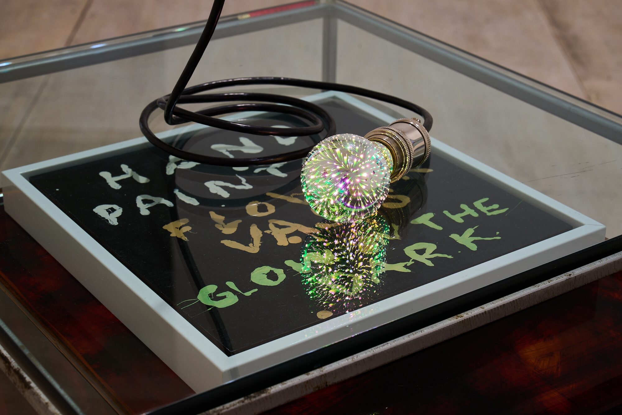
This piece, Venice Beach (2011–25), is the closest thing to a sculptural documentation of a performance that I can see in the show. It includes a sign that you made for painted flower vases that you sold on Venice Beach in Los Angeles. Did you live out there during COVID?
I was in a long-distance bicoastal relationship from 2010 until 2011 with someone in LA. In 2011, I was living in Silver Lake with him and made the “vases.” I would take the bus out to Venice Beach to sell them. I had no job, and I was smoking too much weed. When you’re in your twenties, you experiment more.
Did you have a studio?
I used the backyard as a studio. I was painting with twigs that were lying around, and took advantage of the fresh air, using enamel paint, which has really intense fumes, but looks best on the glass bottles. I had those Trader Joe’s wine bottle holder bags to transport them on the bus. But nobody really bought any; I sold maybe five. Some of them I might have even just given away.
You were also participating in a totally different context—it’s beyond a DIY scene.
Yeah, I think I liked that completely non-art market context. I had just gotten out of grad school. I was at that age where everyone in your friend group is either deciding whether they can even make art anymore, or they’re getting super professionalized and cutthroat and not fun. So I was like, “I’m just going to step sideways and see what happens in LA.” The boardwalk at Venice Beach is explicitly a marketplace, so going there to sidestep the art market was a bit ironic, but I wanted a bit of adventure.
So Venice Beach combines a few different pieces?
It was made here on-site. It combines two pre-existing works, and some things we acquired during install. This is why I was so lucky to have Jody Graf as the curator. We were finishing each other’s sentences.
We knew that we had to do something with the hand-painted flower vases sign, because Jody included it in her exhibition text. But it was not working on the walls. Then I remembered that when I sold the vases on Venice Beach, I would sit on the ground cross-legged, with the sign in front of me, on a blanket. I thought maybe we could display the painting flat on a plinth, but there were already too many plinths in the show. I said to Jody, “I think I can find a cool table.” We had five days left of install. I was scouring thrift stores and sending Jody all these pictures of options. We couldn’t decide between the chrome glass table and this Plexi box that looked like it was made at Canal Plastics and then splatter-painted. Jody said, “Let’s get both. You can play around in the space.” When we were waiting for the Uber to pick them up, we nested them just like that on the sidewalk, and were like, “They go together, they’re perfect.”
While I was lightbulb shopping, I found this silver, star-motif rainbow bulb. It’s like the inverse of the spinning rainbow bulb in the smallest room. That one is projecting light outward, and this one looks like it’s pulling it in.
The table piece was still developing, and it seemed like it needed something on top. I got the components at the lighting supply store to make the cord super long, so the light would look like a microphone resting on the table. When I do readings, I’ll try to use a microphone with a long cord. I’ll wrap it around my throat like my favorite hardcore singer Bob Otis. The knife is its own piece (Sigh Co., 2020). During install, I was joking around and stuck the knife on the metal edge of the table, because it uses magnets as its hanging device. But then I realized, “That’s really good. It stays.”
Wendy Vogel is a writer and art critic based in Brooklyn, New York whose work often focuses on issues related to gender, power, identification, and body autonomy. In 2018, she received an Andy Warhol Foundation Arts Writers Grant in Short-Form Writing. She is a part-time assistant professor in the photography department at Parsons School of Design.
Whitney Claflin (b. 1983, Providence, RI) lives and works in New York. Select solo and two-person exhibitions include Derosia, New York (2024, 2020); Drei, Cologne (2024, 2020); Haus Erholung, Mönchengladbach, Germany (2024); Drei (2022); and Real Fine Arts, New York (2017, 2014, 2010). Select recent group exhibitions include Gallery Vacancy, Shanghai (2024); G2 Kunsthalle, Leipzig (2023); Layr, Vienna (2023); Office Baroque, Antwerp (2023); Bonner Kunstverein, Bonn (2022); Sandy Brown, Berlin (2021); Shoot the Lobster, New York (2020); Galerie Buchholz, New York (2019); Croy Nielsen, Vienna (2018); and Greene Naftali, New York (2018).
Photo Assistant: Elizabeth Gramley